
Creator UI overview
OKO version 4.5.0 - CSP 6.34.0
This article will guide you through the OKO Web user interface.
Instructions
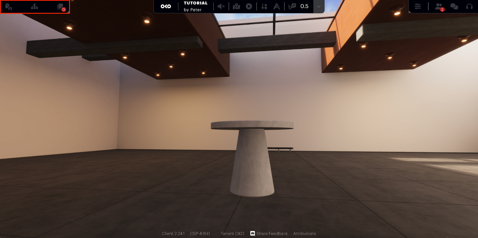
Arranged around the edges of the viewport are four sets of controls to access all the functions OKO provides. These areas will change depending on whether you are in Viewer Mode or Creator Mode. If you are in Viewer Mode, then the central toolbar will be replaced with a simpler toolbar which includes the option to exit Viewer Mode and return to Creator Mode.
When in Creator Mode, you will see the following four sets of controls:
At the top of the screen is the main control toolbar that contains a variety of controls.
At the bottom of the screen is the Content Browser.
On the left is the Control panel that provides access to the common controls for interacting with your space.
On the right is the Inspector & Comms panel that allows you to view object and component properties and chat with others in the space, either via text chat or video calls.
Main control bar
The main control bar contains a range of functions:
 | Play Mode Enter Play Mode. |
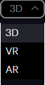 | Current Play Mode Select the mode used when entering Play Mode. |
 | Fly Mode Indicates whether the user has fly-mode active (activate fly mode by holding the shift key). |
 | Navigation Speed Adjust your space navigation speed using the drag control or by entering a new value. |
 | Additional Options From here, you can edit the render style, adjust the visualization mode, and enable collision and icon indicators. |
 | Enter Site Map See a bird ’s-eye view of your site. |
 | Show Map as Terrain If your space is geolocated, this function displays 2D map tiles around your space’s location. |
 | Show 3D Map If your space is geolocated, this function displays 3D map tiles around your space’s location. You will need a Google Maps API key, which can be entered in the settings dialog. |
 | Grid View Toggle the grid view on and off. |
 | Wireframe View Toggle wireframe view mode on and off. |
| Viewing Mode Switch between different view models to visualise the scene in different ways to resolve appearance issues with assets placed in your space.
|
| Visualisations Here you can toggle various visualisations:
|
Left Control panel
The Left panel provides access to content areas. Clicking one of these icons will expand the panel to occupy the left portion of the screen. The content is accessible by clicking on any of the following icons:
 | Hierarchy: This is the hierarchical view of the space’s content. In this view, you can add/remove entities and rearrange the hierarchical structure of your space’s content using drag-and-drop. |
 | Comments: A list of all the comments that have been added about the space. |
 | Hotspots: A list of all the hotspot components that have been added to the space. |
Selecting any item within one of these panels will show the item’s properties in the Properties panel, which is part of the right panel.
Editing controls
 | These buttons control the editing gizmo, with the vertical bar showing the active mode. The available modes are:
|
  | Translate and rotate gizmos can operate in world coordinates This function toggles between the two modes. |
 | This enables the Snap To Surface function. When translating an item using the central grab handle, objects will be placed on the surface of any collision mesh contained within the space. |
 | Information Panel Clicking the information icon
|
 | Help Clicking the help icon |
 | Settings This allows you to update a variety of settings within OKO:
|

| Exit Space Click this button to exit the current space and return to the spaces gallery page. |
Right Inspector & Comms panel
The Right panel performs two main functions:
1. Properties
Primarily, it is where the properties for any item you have selected are displayed  .
.
Those items are:
Entities
Components
Materials
Comments
Assets
2. Communications
The secondary function is to provide access to communications functions. These are:
 | People The list of people currently in the space. |
 | Chat This is where you can interactively chat with other users in the space. Text and emojis can be used in messages. |
 | Call This is where you can see everyone who is using the call feature in the space. When a user has enabled their video feed, you will be able to see them here. You can enable and disable their video feeds just for yourself, and you can also mute anyone, again just for your local session. |
Audio/video multimedia controls
At the bottom of the Right Panel, there are several multimedia control functions.
 | Screenshare Enable and disable screen sharing if you have a Screenshare Component in your space. |
 | Enable / Disable Audio Feed Switch your microphone on and off when in an audio or video call. |
 | Enable / Disable Video Feed Switch your camera on and off when in a video call. |
  | Turn On Sound Toggle the sound of audio elements in the space on/off. |
Space Share
The final option in the Right panel provides access to the Share options  . This is where individual users can be added as Viewers or Creators to your space. It is also possible to make the space generally available to all OKO users without explicitly inviting them to it.
Content Browser
The Content Browser consists of three separate groups:
Assets: Libraries of assets available to be added to your space.
Materials: The library of custom materials that have been created in your space.
Templates: A library of pre-configured components that can be added to your space.
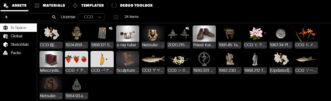
Assets
The Assets panel has four categories, all of which can be added to your space.
In Space
In the In Space category, you will find all of the assets that have been uploaded while in this space. When you first join a newly created space, this library panel will only contain the assets from the template space used when creating your space, but once uploaded, new assets will also appear here. Assets can be uploaded to this panel directly using the upload button  or by dragging them from a file explorer view directly into the space view. For more information on how to upload your own assets, please check out this article: Importing assets
Assets can also be created using the AI-assisted technology using Gemini AI or Magnopus' Nodey – a web-based workspace that creates a unified, secure experience for Generative AI creation.
Global
The Global Category contains assets that are available to all users, in all spaces. Assets can be uploaded in the same way you would upload an asset for the In-Space category.
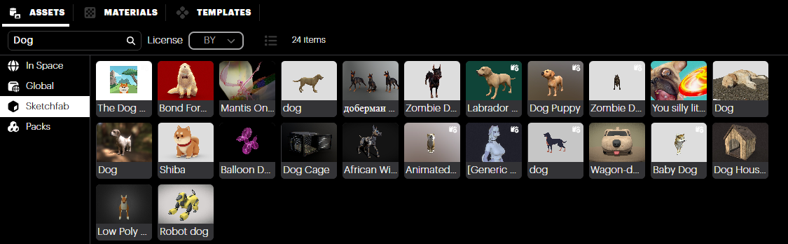
Sketchfab
OKO offers Sketchfab integration. You will need to connect OKO to your Sketchfab account, but once configured, you can access your saved asset Collections (more on using Sketchfab Collections here).
To connect your account, click the Connect Sketchfab button, and the following window will appear.
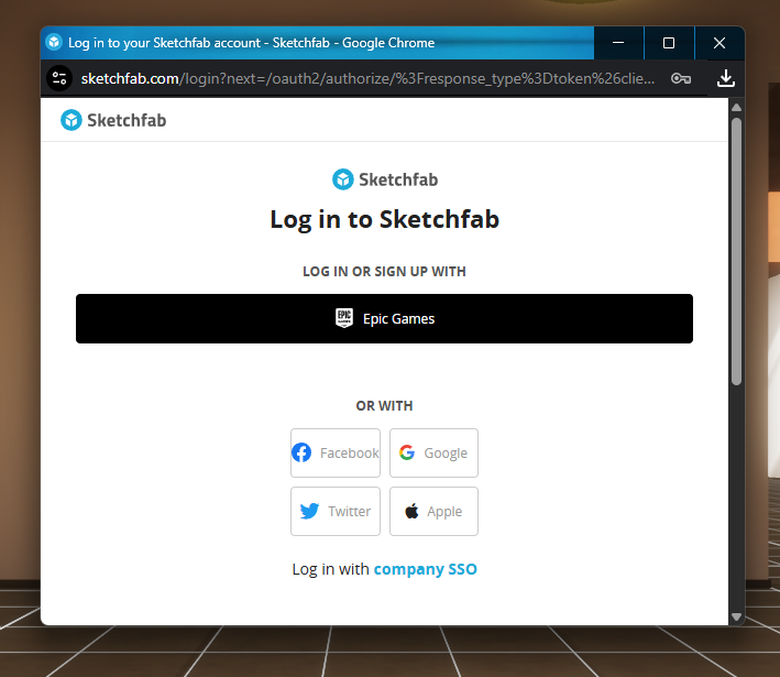
Select Accept, and the assets will appear in your library. You can even use the Sketchfab database and search for assets to upload to OKO.
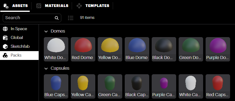
Packs
In addition to being able to upload your own custom assets, OKO also offers a selection of essential assets and primitive objects to get you started.
Templates
In the templates group, you will find common objects grouped into categories for ease of access.
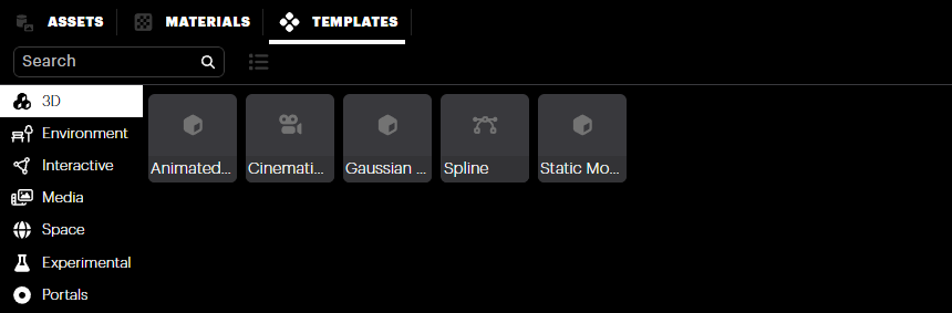
3D: Contains templates for all 3D geometry components.
Environment: Contains templates for components that affect the environment, such as lighting, fog and reflection probes.
Interactive: Contains templates for components that add interactive elements to your space, such as colliders and triggers, as well as buttons, external links, and portals.
Media: Contains templates for audio, video, image, and text components as well as screen sharing.
Space: Contains templates for fiducial markers and hotspots for navigating within a space, and an entity creation template.
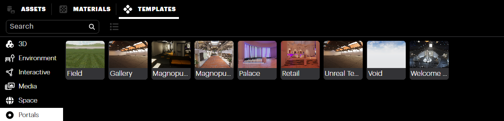
Portals: The portals sub-option allows you to add portal objects to your environment. These portals enable a user to travel between spaces you have authored, connecting multiple spaces together in an experiential flow.
That’s it for the creator UI overview!