
Text Components
OKO Web 4.6.1 | OKO Unreal 4.8.2 | CSP 6.36.0
The Text Component represents a surface in the space where text is rendered. It can be useful when providing spatial labels to content around a space.
This page details properties specific to the component. For general component properties, find more information here.
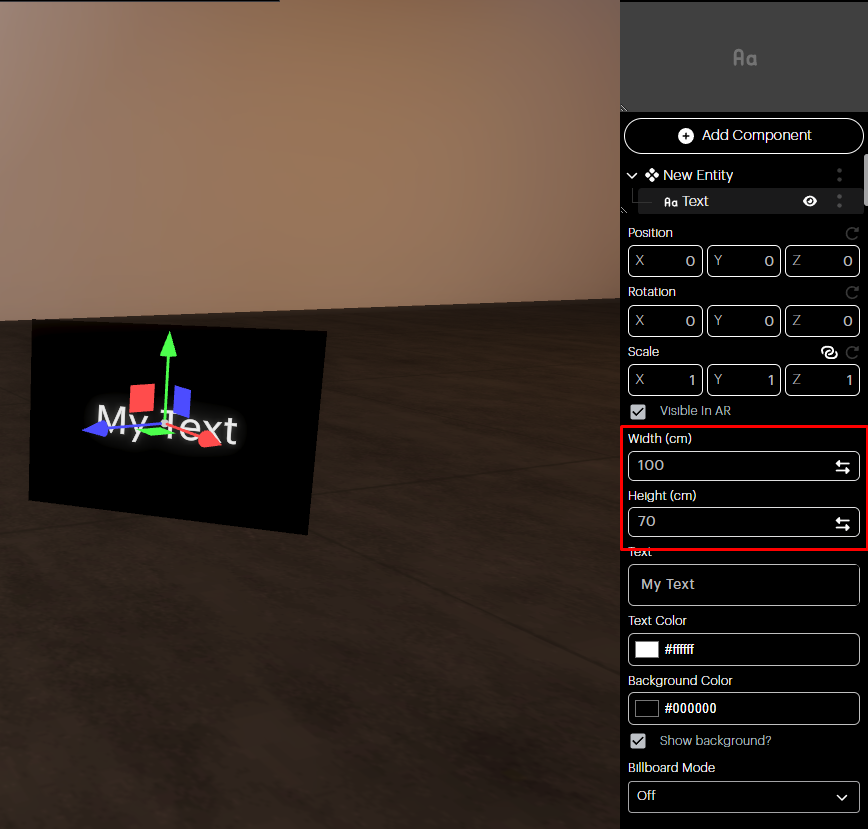
Width and Height: Adjust the width and height of the Text Component using the two fields shown in the image.
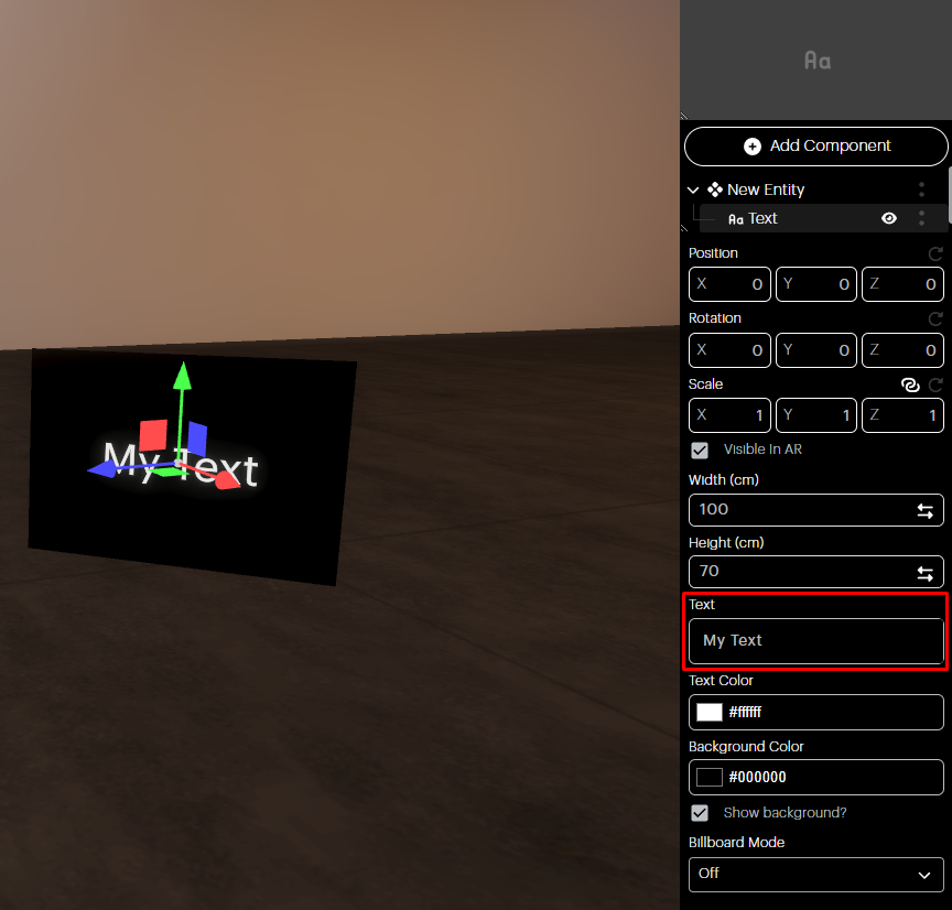
Text: Type the text you would like to see in the space.
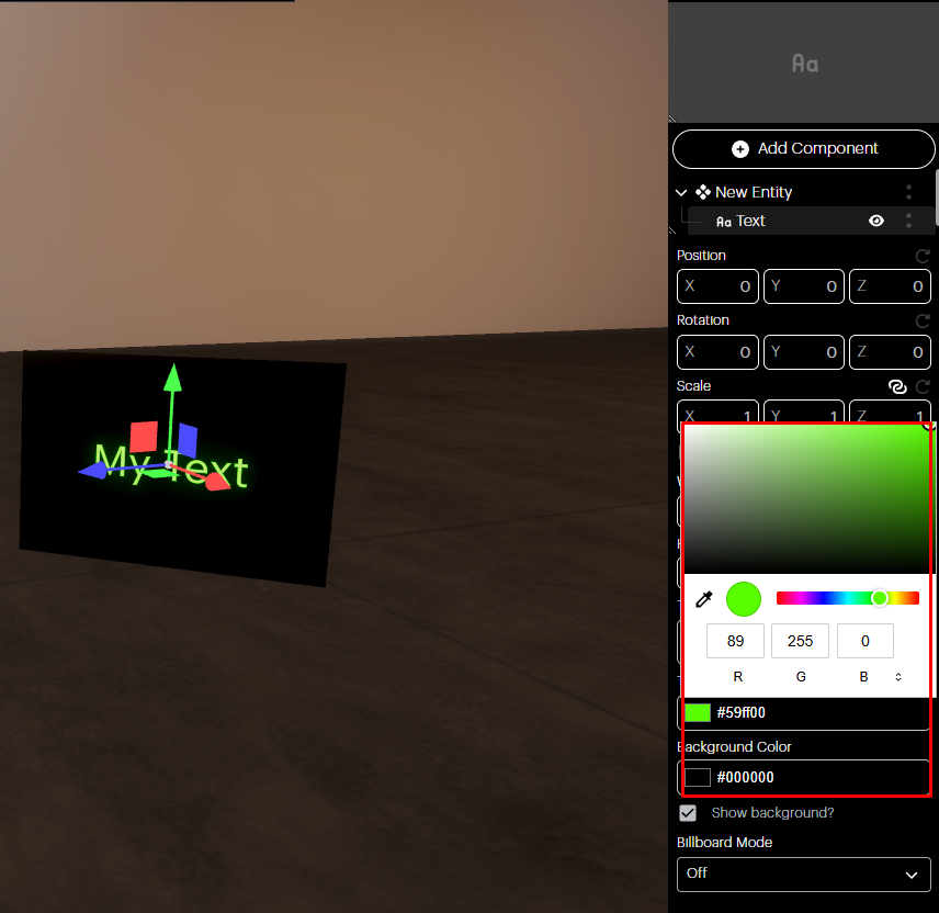
Text and background color: You can choose the color of the text and background by using the Color panel.
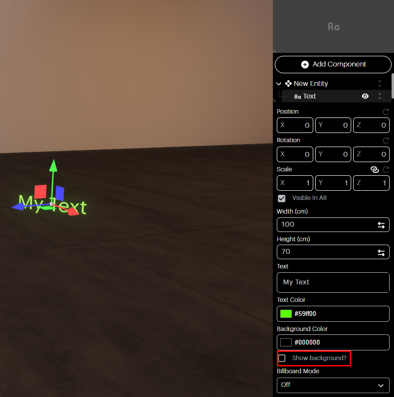
Show Background? Check the box on and off to show or hide the background color of the text.
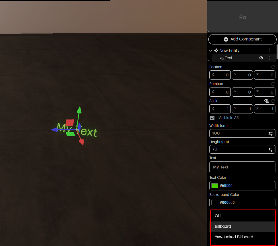
Billboard Mode: Here you can choose the Billboard Mode of your text component:
Off: Billboard Mode is off.
Billboard: The text faces the camera in the XYZ axis.
Yaw Locked Billboard: The Billboard is locked to the vertical Y axis.
On OKO iOS
You can only transform, view in AR, and delete Text Components from a space in OKO iOS. For more detailed edits, use OKO Web or the OKO Unreal Plugin.
To begin editing the Text Component in iOS, press and hold the Text Component to select it.
Once selected, the component will be highlighted. Using a single finger, you can drag and move it around the space.
By clicking the two dots on the right top corner of the screen, you can unlock the scaling tools to rotate and scale the Text Component in the space. From this menu, you also have the option to delete it from the space entirely.
Use two fingers to scale the component, and use three to rotate it.
View the Text Component in AR by clicking the View in AR button in the lower-left corner of the screen.