
Button Components
OKO Web 4.6.1 | OKO Unreal 4.8.2 | CSP 6.36.0
The Button Component represents a clickable/pressable button which exists in 3D space. Button presses can be responded to in script and used to drive interactivity.
This page details properties specific to the component. For general component properties, find more information here.
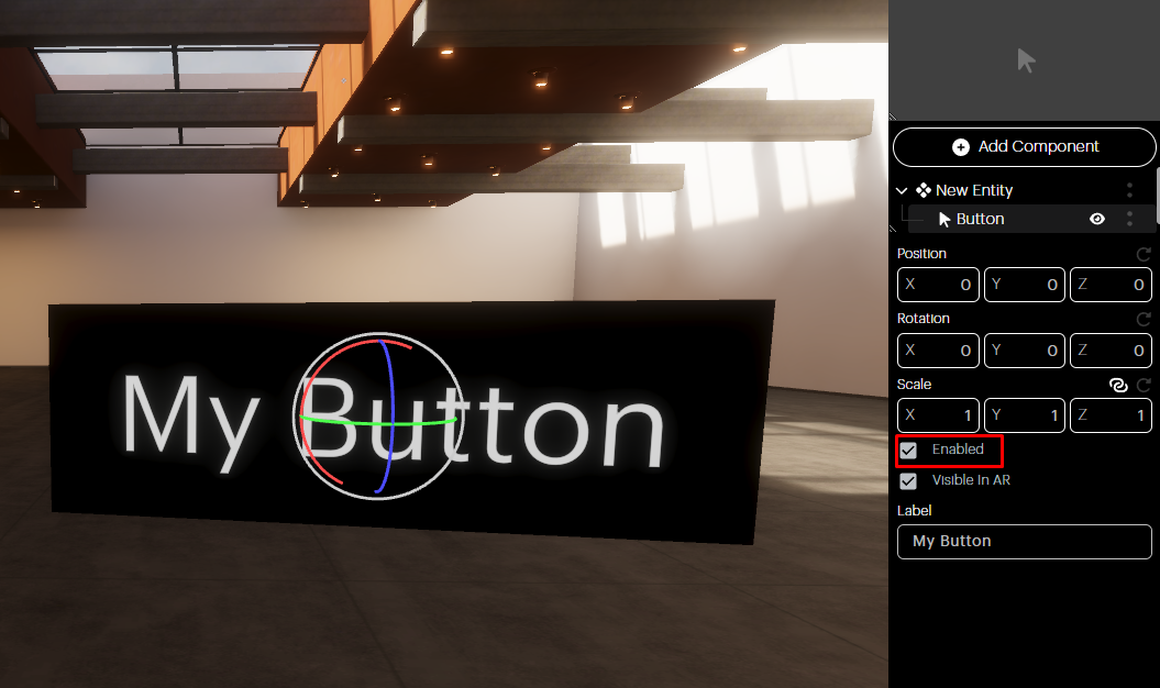
Enabled checkbox: If you want your Button Component to exist in the space, but not be activated, uncheck the Enabled box.
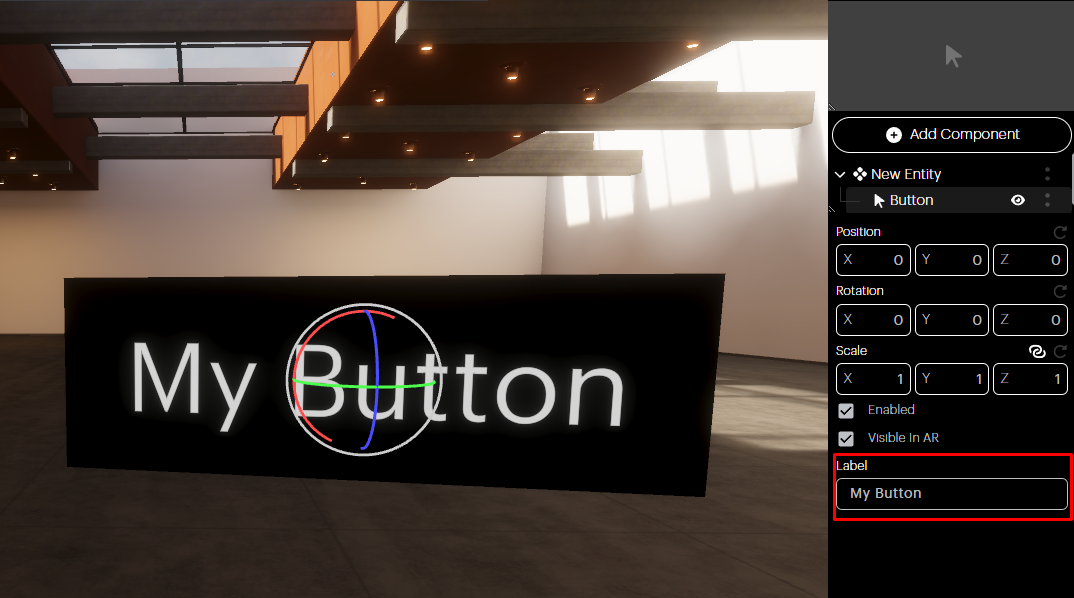
Label: The button’s label can be adjusted via this text box.
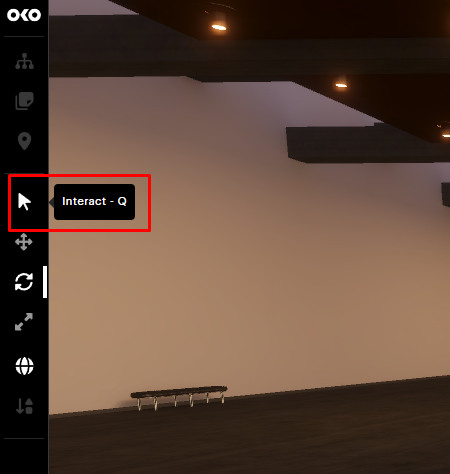
When you’re finished setting up your component, you’ll want to test it.
You can emulate another user clicking on the button by toggling the Interact modality on the left sidebar.
Then, hover over the Button Component and confirm that its visual state changes.
Click on it and confirm the button reacts.
The button can be used to create interactive experiences, which require Script Components to respond to button click events and can, in turn, control the state of other components.
So, for example, a light switch could be created by having a Script Component control the intensity of a light whenever a button is clicked.